Contrary to popular belief, achieving an expensive, Michelin-level look isn’t about complex garnishes, but about the strategic use of empty space on the plate.
- Negative space directs the diner’s gaze, creating a focal point and a clear narrative for the dessert.
- Artistic principles like the ‘rule of odds’ and ‘compositional tension’ are essential for dynamic, professional-looking compositions.
Recommendation: Stop filling the plate; start composing it. Treat the empty space as your most important ingredient.
You’ve baked the perfect chocolate lava cake. The ganache is glossy, the crumb is tender. You place it on a plate, add a scoop of ice cream, scatter some berries, and finish with a dusting of cocoa. Yet, instead of looking like a masterpiece from a high-end restaurant, it looks… cluttered. This is a common frustration for home cooks who possess culinary skill but lack a grasp of visual artistry. The instinct is to fill the void, to add more elements in the hope of creating a sense of luxury.
The conventional wisdom often involves superficial tips: add a mint sprig, use a stencil for powdered sugar, or create a sauce zigzag with a squeeze bottle. While not inherently wrong, these actions are mere decoration. They don’t address the fundamental structure of the composition. The secret to elevating your presentation from homemade to haute cuisine doesn’t lie in what you add, but in what you consciously choose to leave out. The key is mastering negative space—the empty areas of the plate that frame and give power to your dessert.
This is where we shift our thinking from a cook to an art director. A plate is a canvas. Every element you place must have a purpose, contributing to a cohesive visual story. It’s not about random placement; it’s about controlling the diner’s gaze, creating movement, balance, and a focal point. This guide will deconstruct the core principles of professional plating, moving beyond simple garnishes to explore the powerful concepts of compositional tension, architectural structure, and intentionality.
By understanding these artistic foundations, you will learn to wield negative space as your most effective tool. We will explore how a few simple rules of composition can transform your plate, why the shape of your dish matters, and how to execute techniques with precision. Prepare to unlearn the impulse to fill the plate and embrace the elegance of a well-composed frame.
This guide breaks down the essential artistic principles that transform a simple dessert into a visual masterpiece. In the following sections, we’ll explore specific, actionable techniques to help you master the art of professional plating, starting with a foundational rule of composition.
Summary: The Art Director’s Guide to Michelin-Level Dessert Plating
- Why Do 3 Raspberries Look Better Than 4 on a Tart?
- How to Add Verticality to a Flat Brownie Plate?
- Round vs. Rectangular: Which Frame Suits Linear Desserts Best?
- The ‘Squeeze Bottle’ Mistake That Looks Like a 90s Cafeteria
- When to Wipe the Rim: The Final Step 90% of Home Cooks Forget
- What Color Plates Make Chocolate Desserts Look 50% More Appetizing?
- How to Remove Micro-Bubbles from Glaze Without popping them manually?
- How to Transform Simple Chocolate Desserts into 3-Star Michelin Plates?
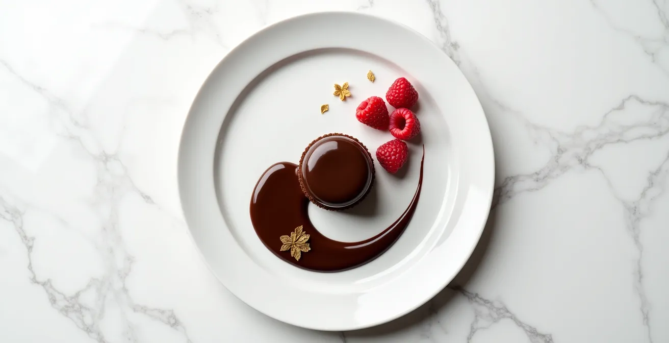
Why Do 3 Raspberries Look Better Than 4 on a Tart?
The human brain is wired to seek patterns, and in visual composition, even numbers create symmetry and stability. Two, four, or six raspberries on a plate are easily paired up by the eye, creating a static, predictable arrangement. It feels orderly but often lacks energy. An odd number, however, disrupts this easy pairing. With three raspberries, one is left over, creating an “orphan” element. This forces the diner’s gaze to move between the items, creating a subtle visual tension and a more dynamic, engaging composition. This is known as the Rule of Odds, a cornerstone of art, photography, and high-end culinary design.
This principle is not just an aesthetic preference; it has a measurable psychological impact. Scientific research demonstrates that attractive plate designs with odd-numbered elements significantly boost perceived food tastiness. The slight imbalance created by an odd number feels more natural and less manufactured, which our minds often associate with higher quality. As the experts at Culinary Arts Switzerland explain, this is about creating an active viewing experience.
Odd numbers create a lone element, forcing the eye to move and engage with the composition, making it feel more dynamic.
– Culinary Arts Switzerland, The Art of Plating Food: Techniques for Stunning Visuals
Understanding when to use odd versus even numbers allows you to control the mood of your plate. A formal, modern dessert might benefit from the rigid symmetry of an even number, but for most applications where you want to create a sense of natural elegance and visual interest, odd numbers are your most reliable tool. The following table breaks down the fundamental differences in their visual impact.
| Number Pattern | Visual Effect | Brain Processing | Best Use Case |
|---|---|---|---|
| Odd (3, 5, 7) | Dynamic, natural | Creates movement, engages attention | Garnishes, berries, small elements |
| Even (2, 4, 6) | Static, formal | Quick pairing, feels manufactured | Symmetrical modern presentations |
| Single (1) | Focal point | Immediate attention | Hero element, statement piece |
How to Add Verticality to a Flat Brownie Plate?
A common mistake in home plating is creating a landscape that is entirely flat. A brownie, a scoop of ice cream, and a pool of sauce all occupy the same horizontal plane, resulting in a composition that lacks drama and sophistication. Adding verticality—elements that reach upwards—is the single most effective way to break this monotony and add architectural dimension to your plate. It instantly elevates the perceived value and complexity of the dessert by creating visual excitement and a more three-dimensional experience.
Think of it as building a small sculpture. The goal is to draw the eye upward, away from the surface of the plate. This doesn’t require complex or exotic ingredients. The key is to repurpose or create components that can stand tall. For a simple brownie, this can be achieved with a variety of techniques. A shard of dark chocolate, a delicate tuile cookie, or a crisp meringue “kiss” placed strategically against the brownie can provide instant height. Even the shape of your ice cream matters; a professionally formed quenelle has an elegant, curved lift that a simple round scoop lacks.
For more advanced applications, consider creating elements specifically for this purpose. A classic technique is a spun sugar cage, which adds dramatic height and a delicate texture. You can also craft chocolate “sails” by spreading tempered chocolate thinly on acetate paper and letting it set in a curved shape. Even a simple garnish, like a long, curled citrus peel or a sprig of mint placed upright in a dollop of cream, contributes to the vertical narrative. The goal is not to build a tower, but to introduce at least one element that confidently breaks the horizontal line, creating a dynamic interplay of height and depth.
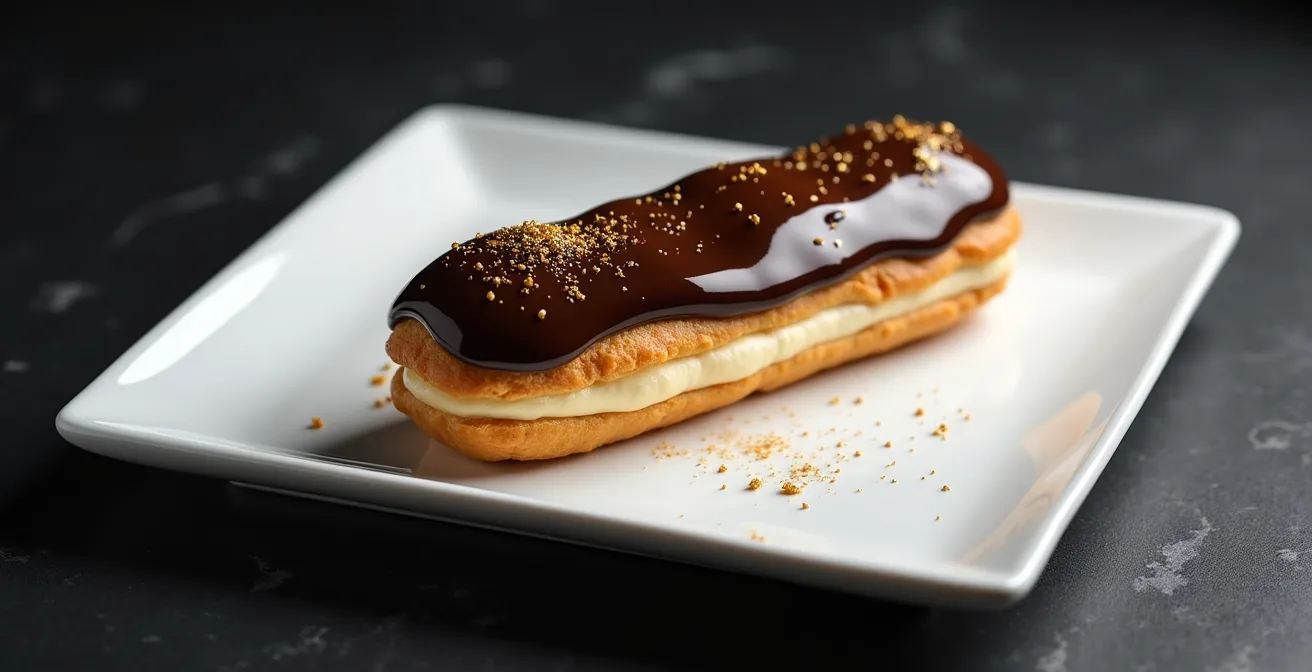
Round vs. Rectangular: Which Frame Suits Linear Desserts Best?
The plate is not just a vessel; it is the frame for your culinary art. The shape of this frame profoundly influences how the dessert is perceived. Just as a painter chooses a canvas, a chef must choose a plate that complements the composition. When dealing with linear desserts—such as an eclair, a bar, or a deconstructed arrangement of elements in a line—the choice between a round and a rectangular plate creates dramatically different effects. There is no single “correct” choice; rather, the decision depends on the story you wish to tell.
A rectangular plate offers a structured, modern, and assertive backdrop. Placing a linear dessert parallel to the edge of a rectangular plate accentuates its clean lines, creating a sense of order and bold geometry. This is an excellent choice for minimalist, architectural presentations. Conversely, placing the dessert diagonally across a rectangular plate creates compositional tension. The clashing lines—the straight edges of the plate versus the diagonal of the dessert—generate energy and a strong focal point. A round plate, on the other hand, is softer and more traditional. It has no hard edges or corners, giving it a more organic and gentle feel. Placing a linear dessert on a round plate creates a beautiful contrast between the soft curve of the frame and the straight line of the food. This juxtaposition can soften the rigidity of a modern dessert or add a touch of dynamic flair to a classic presentation.
The psychology of these shapes, as detailed in an analysis of modern food presentation styles, is a powerful tool for a plating artist. The following table provides a clear guide on how to match plate shape to your desired visual outcome.
| Plate Shape | Psychological Impact | Best for Linear Desserts | Visual Effect |
|---|---|---|---|
| Round | Organic, traditional, gentle | Creates dynamic tension with straight lines | Softens rigidity, classic feel |
| Rectangular | Modern, structured, assertive | Accentuates clean lines when parallel | Bold, architectural statement |
| Square | Balanced, contemporary | Creates diagonal opportunities | Versatile, controlled composition |
The ‘Squeeze Bottle’ Mistake That Looks Like a 90s Cafeteria
There is perhaps no technique more emblematic of dated plating than the uncontrolled chocolate sauce zigzag. Popularized in the 1990s as an easy way to add “flair,” the squeeze bottle became a crutch for kitchens everywhere. The problem isn’t the tool itself, but its thoughtless application. The repetitive, back-and-forth motion lacks intention and has become a visual cliché. It fills negative space without purpose, creating visual noise rather than a clear focal point. According to a professional plating analysis, its decline was inevitable.
The overuse of this technique has exhausted its impact, making it look cheap and uninspired. A modern art director would argue that any mark on the plate must be deliberate. It should either guide the eye, provide a counterpoint to another element, or serve as a foundational part of the composition. The haphazard zigzag does none of these things effectively. Fortunately, there are numerous modern, elegant alternatives that demonstrate control and artistry, transforming a simple sauce from a chaotic garnish into an integral design element.
Techniques like the “swoosh” or “drag,” created with the back of a spoon, offer a graceful, directional line. Carefully placed dots of varying sizes can create a beautiful, artistic pattern that leads the eye across the plate. For a truly advanced approach, modern gastronomy has introduced methods like turning fruit purées into “leathers” or transforming liquids into flavored powders with maltodextrin. These techniques add not only flavor but also a surprising texture and a clean, geometric aesthetic. The key takeaway is to replace random motion with controlled gestures.
Action Plan: Modern Sauce Application Alternatives
- Execute the controlled ‘swoosh’ using the back of a spoon—place a sauce dot, then drag it in one confident motion to create a teardrop shape.
- Master pressure-controlled dots by varying squeeze intensity to create different sized dots arranged in artistic, intentional patterns.
- Create fruit leathers by dehydrating puréed fruit at 60°C for 6-8 hours, then cutting the sheet into precise geometric shapes.
- Use tapioca maltodextrin to transform high-fat liquid sauces (like olive oil or caramel) into flavored powders for a delicate dusting effect.
- Apply sauce as a fine mist using food-safe atomizers for an ethereal cloud of flavor that doesn’t add heavy visual weight.
When to Wipe the Rim: The Final Step 90% of Home Cooks Forget
A clean, pristine rim is the culinary equivalent of a perfectly ironed shirt—it signals precision, care, and professionalism. Forgetting to wipe away smudges, fingerprints, or stray drips is one of the most common oversights that instantly cheapens a presentation. This final check is a non-negotiable step in any professional kitchen. It creates a clean “frame” that isolates your dessert, forcing the diner’s eye to focus on the composition within. The absence of distractions on the rim ensures that the negative space surrounding the food can do its job effectively.
The technique for achieving this perfect finish requires more than a simple paper towel. A professional uses a lint-free cloth, often lightly dampened with a solution of white vinegar and hot water, which cuts through grease and leaves a streak-free shine. The motion is also deliberate: a single, confident wipe around the entire circumference of the plate ensures a consistent, clean edge without redepositing smudges.
However, in modern gastronomy, rules are made to be broken—but only with intention. The concept of an “intentional mess” has been popularized by avant-garde chefs like René Redzepi of Noma. This is not the same as a sloppy, accidental smudge. An intentional smear, a controlled splatter, or a dusting of cocoa powder that purposefully breaks the boundary of the rim is a deliberate artistic choice. It can add a sense of movement, rusticity, or abstract expressionism to the plate. The difference lies in control and purpose. A stray fingerprint is a mistake; a carefully executed brush flick of sauce is a statement. Whether you opt for a perfectly clean rim or an intentional mark, the decision must be conscious and contribute to the overall narrative of your dish.
Your Checklist: The Professional Rim Protocol
- Acquire your tools: a lint-free microfiber cloth and a solution of one part white vinegar to three parts hot water.
- Perform the clean wipe: Dampen the cloth slightly, and wipe the rim in a single, continuous directional motion for a flawless finish.
- Consider the “intentional mess”: For a modern look, use a fine-mesh sieve for a controlled dusting of cocoa powder that just kisses the edge of the plate.
- Practice the artistic splatter: Load a small, clean brush with sauce, hold it at a 45° angle, and execute a single, sharp flick of the wrist toward the plate.
- Conduct the final inspection: Hold the finished plate under a direct light and rotate it 360 degrees to catch any final fingerprints or unwanted marks before serving.
What Color Plates Make Chocolate Desserts Look 50% More Appetizing?
While there isn’t a single color that universally boosts appetite by a precise figure, the principle is sound: the color of your plate has a dramatic effect on how a dessert is perceived. This phenomenon, studied in the field of gastrophysics, shows that our brains make powerful associations based on color contrast, harmony, and cultural context. As a gastrophysics research team notes, the plate is an active participant in the dining experience, not a passive background.
For chocolate desserts, two primary strategies can be employed. The most classic and impactful is using a stark white plate. The high contrast between the dark, rich tones of the chocolate and the bright, clean canvas of the plate makes the dessert pop. It creates a clear focal point, communicates freshness and quality, and allows the colors and textures of the dessert itself to be the hero. This is the safest and often most effective choice, especially for intricate compositions where you want every detail to be visible.
The second strategy is to use a dark plate—such as charcoal grey, slate, or matte black. This creates a low-contrast, monochromatic, or analogous color scheme. Instead of making the dessert “pop,” this approach creates a sense of mood, drama, and sophistication. A dark plate can make a chocolate dessert feel more decadent, mysterious, and luxurious. It works especially well for simpler compositions, where the focus is on the rich texture and deep color of the chocolate itself. However, be mindful of visual weight; a very dark dessert on a very dark plate can sometimes get lost. To counteract this, ensure you have a contrasting element, like a vibrant berry coulis, a dusting of white powdered sugar, or a dollop of bright white cream, to provide a point of visual entry.
The shape, size, and colour of the plate shifted how appealing a dessert looked. The features of the plate also affected how much people thought it was worth, and even how modern or traditional it felt.
– Gastrophysics Research Team, The Conversation
How to Remove Micro-Bubbles from Glaze Without popping them manually?
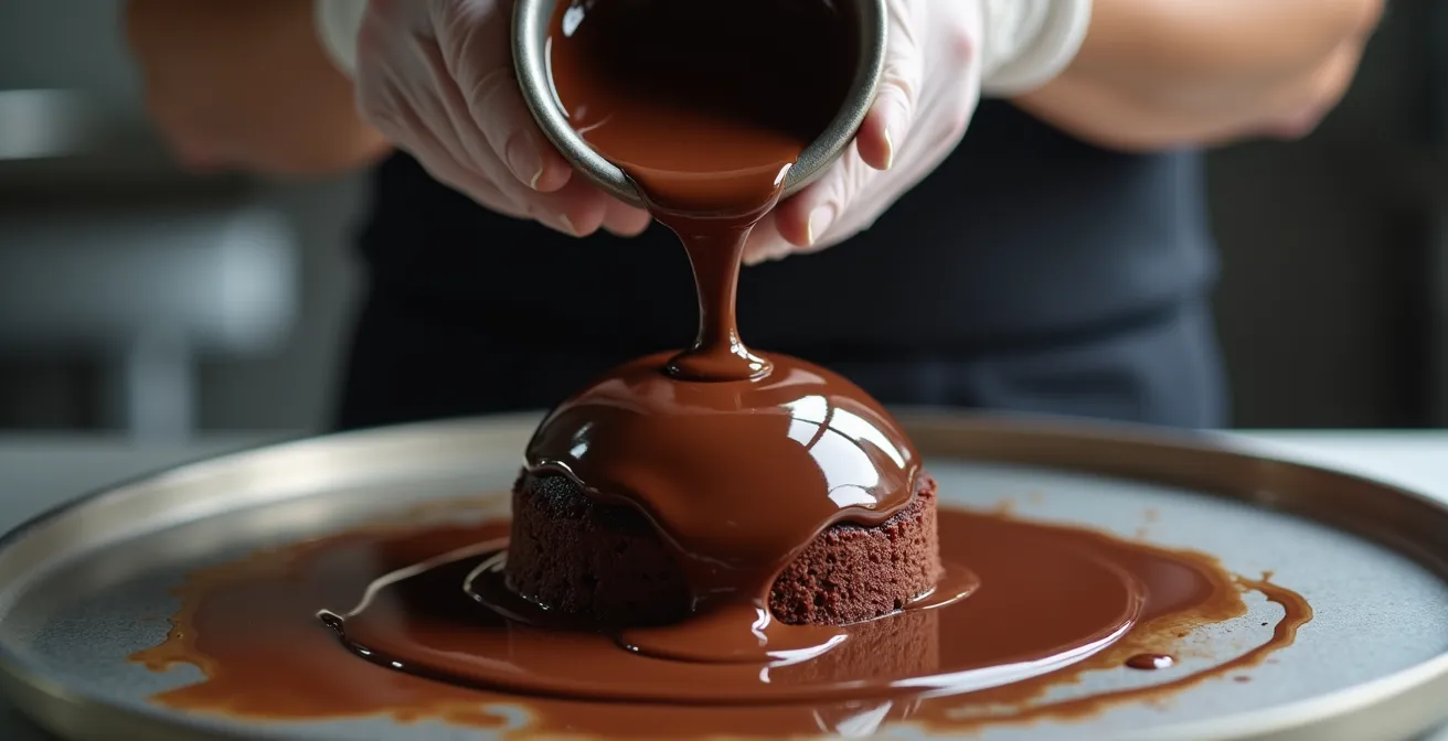
A flawless, mirror-like glaze is the pinnacle of patisserie craftsmanship. The appearance of tiny micro-bubbles on the surface can ruin the illusion, signaling a lack of technical refinement. These bubbles are typically caused by air being incorporated during the blending process. Popping them one by one with a toothpick is tedious and often leaves small imperfections. A true professional prevents them from forming or removes them efficiently before the glaze is ever poured. This requires an understanding of fluid dynamics and temperature control.
The primary culprit is improper use of an immersion blender. Plunging it straight down or lifting it while it’s running will whip air into the mixture. The correct technique is to submerge the blender blade fully at a 45-degree angle before turning it on. This creates a downward vortex that pulls the mixture down and forces air bubbles up and out, rather than folding more air in. Blending in short, controlled pulses in one direction is far more effective than a continuous, high-speed blend.
Temperature and viscosity are also critical. A glaze that is too thick will trap air, while one that is too thin will lack coverage. Letting the glaze rest at its ideal application temperature (typically around 35-40°C) allows bubbles to naturally rise and dissipate. For stubborn bubbles, a professional might pass the glaze through a fine-mesh sieve or, in high-end settings, use a vacuum chamber to literally pull the dissolved air out of the liquid. These techniques ensure a perfectly smooth, bubble-free surface that reflects light like polished glass, providing the ultimate professional finish.
Action Plan: De-Gassing a Glaze for a Perfect Finish
- Master the immersion blender technique: Submerge the blade fully at a 45° angle before starting, and use short pulses to create a vortex that expels air.
- Control the temperature: Allow the glaze to rest at its optimal working temperature (e.g., 40°C) for 10-20 minutes, giving bubbles time to rise naturally.
- Adjust the viscosity: If the glaze is too thick and trapping air, a small addition of a liquid sugar like glucose syrup can reduce surface tension and help bubbles escape.
- Strain for perfection: Gently pour the finished glaze through a fine-tahini sieve (chinois) to catch any remaining bubbles or undissolved particles.
- Use the vacuum method (advanced): Place the glaze in a vacuum-seal container and pump to a partial vacuum for several minutes to force all dissolved air to expand and escape.
Key Takeaways
- Embrace the Rule of Odds: Use odd numbers for small elements like berries to create a dynamic, natural-looking composition.
- Build Upwards: Introduce vertical elements like chocolate shards or quenelles to add drama and break the flat plane of the plate.
- The Plate is the Frame: Choose plate shapes and colors intentionally to either contrast with or complement your dessert’s form and mood.
How to Transform Simple Chocolate Desserts into 3-Star Michelin Plates?
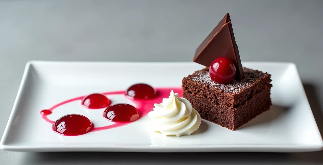
We have explored the specific tactics—the rule of odds, verticality, sauce application—but transforming a simple dessert into a Michelin-level plate is about integrating these into a single, cohesive philosophy. It is the shift from decorating a dessert to designing an experience. The ultimate goal is to create a plate with a clear narrative path, where every element has a reason for being and the diner’s gaze is directed with purpose. This is where negative space becomes your lead actor, not a supporting character.
A simple chocolate cake can become a work of art through deconstruction. Instead of a single slice, imagine the components separated on the plate: a perfect cube of sponge, a silky quenelle of mousse, a pool of glistening sauce, and a crispy, textural element. This approach, grounded in architectural principles, allows each component to shine while contributing to a greater whole. You begin by placing the “hero” or heaviest element off-center, creating an immediate focal point. From there, you use other elements, like dots of sauce or a scattering of crumble, to create a line or curve that guides the eye towards secondary points of interest. This creates movement and discovery.
The final layer is ensuring the first bite is perfect. The arrangement should be designed so that a single spoonful from the “entry point” of the dish can capture a representation of all the key flavors and textures. It is a functional consideration as much as an aesthetic one. This holistic approach—combining artistic composition with a thoughtful eating experience—is what separates a pretty dessert from a truly memorable one.
Now, you have the framework. You understand that plating is not an afterthought but a discipline of design. Your next dessert is a blank canvas. Do not rush to fill it. Step back, consider the narrative, and compose with intention. Your journey from home cook to culinary art director begins now.