The leap from good to great in dessert presentation lies not in complex skills, but in mastering the psychology of visual design.
- Compositional rules, like using an odd number of elements, create dynamic visual tension that engages the eye.
- Strategic color choices, both on the plate and in the garnishes, can subconsciously manipulate flavor perception and perceived value.
Recommendation: Start thinking like a culinary art director: focus on the story and emotion of your plate, not just the ingredients.
Every home baker knows the feeling: you’ve created a chocolate dessert that tastes divine, with a deep, complex flavor profile and a perfect texture. Yet, when placed on a plate, it looks… homemade. It lacks the intentionality and polish that signal a high-end culinary experience. The common advice is to add a swirl of sauce, a sprig of mint, or a dusting of cocoa powder. But these are mere decorative afterthoughts, not integrated design choices.
What if the secret to elevating your desserts wasn’t about adding more, but about understanding more? The transformation from a simple dessert to a Michelin-worthy plate is not a matter of expensive equipment or impossibly difficult techniques. It’s a shift in mindset. It’s about moving from the role of a baker to that of a culinary art director, one who understands that we eat with our eyes long before we take the first bite. The true key lies in mastering the principles of visual storytelling: tension, harmony, and narrative.
This guide will deconstruct the philosophy behind 3-star plating. We will explore why the visual presentation fundamentally alters flavor perception, how to apply core principles of artistic composition to your desserts, and how to develop a signature style that tells a story on the plate. By the end, you will have the framework to think like a designer and turn any chocolate creation into a piece of edible art.
To guide you through this artistic journey, this article breaks down the core concepts that separate amateur decoration from professional plating. Explore the sections below to master each element of visual dessert design.
Summary: The Art and Science of Michelin-Worthy Chocolate Plating
- Why Does Plating Affect the Flavor Perception of Dark Chocolate?
- How to Create Glossy Chocolate Decorations in Under 10 Minutes?
- Sculpture vs. Flavor: Which Should Prioritize for a Wedding Centerpiece?
- The Over-Garnishing Mistake That Ruins 80% of Elegant Chocolate Tarts
- What Color Plates Make Chocolate Desserts Look 50% More Appetizing?
- Why Do Blue Chocolates Sell Less Than Red or Gold Ones?
- Why Do 3 Raspberries Look Better Than 4 on a Tart?
- How to Design Signature Bonbons That Stand Out on Instagram?
Why Does Plating Affect the Flavor Perception of Dark Chocolate?
The experience of eating begins far before the fork reaches your mouth. It starts with a visual promise. For a dark chocolate dessert, this promise is one of richness, intensity, and luxury. The way a dessert is plated is not mere decoration; it’s a form of sensory communication that sets expectations and can fundamentally alter the perception of taste. This phenomenon is grounded in psychology, where the brain makes powerful associations between what it sees and what it anticipates tasting. A meticulously crafted plate signals quality, care, and expertise, priming the palate for a superior flavor experience.
This concept of perceptual value extends beyond the food itself. Culinary research has shown that external cues heavily influence our judgment. As plating experts note, even the weight of the cutlery can influence how highly guests rate the food. A heavier fork feels more substantial and luxurious, subconsciously transferring those qualities to the dessert. A clean, well-composed plate with defined negative space feels intentional and modern, suggesting the flavors will be equally refined and balanced.
For dark chocolate, with its potential for bitterness, a beautiful presentation can psychologically sweeten the deal. The visual harmony of a glossy surface, a vibrant berry, or a delicate tuile creates a positive first impression that can make the chocolate taste richer, less bitter, and more satisfying. In essence, you are not just plating a dessert; you are crafting the opening scene of a sensory narrative, and a compelling visual start makes for a much more memorable ending.
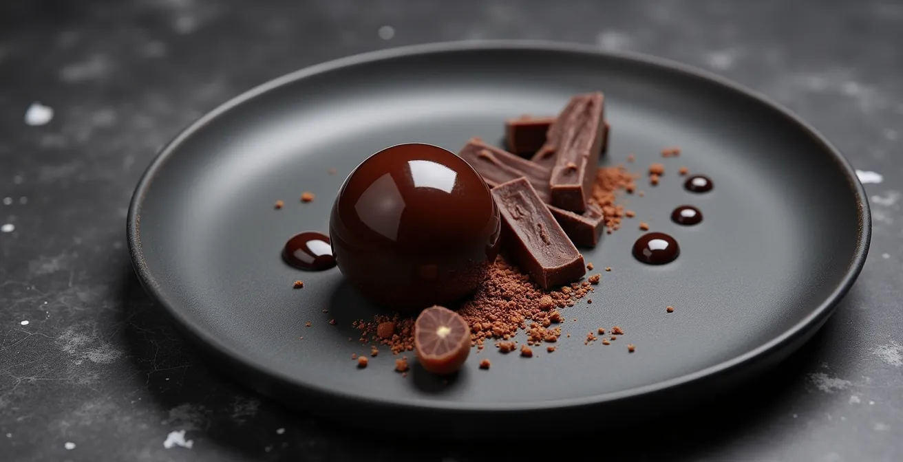
How to Create Glossy Chocolate Decorations in Under 10 Minutes?
One of the hallmarks of a professional dessert is the presence of impossibly thin, glossy chocolate decorations. These elements add height, texture, and a touch of elegance that instantly elevates a simple tart or mousse. While they look complex, the secret isn’t hours of labor but a mastery of one core technique: chocolate tempering. Properly tempered chocolate has a satisfying snap, a beautiful sheen, and is stable at room temperature. The good news is that modern methods have made this process accessible to home chefs without specialized machinery.
The goal is to encourage the formation of stable beta crystals in the cocoa butter. Professional chefs sometimes use Mycryo, a powdered cocoa butter, to seed melted chocolate for near-instant tempering. However, a microwave and a good digital thermometer can achieve excellent results. The key is precise temperature control. Once your chocolate is tempered, you can create a variety of shapes quickly. Spreading it thinly on an acetate sheet allows you to cut out discs, triangles, or other forms as it just begins to set.
For a beginner-friendly approach to creating simple, elegant decorations, follow these steps:
- Temper the Chocolate: Using a microwave, melt dark chocolate in short 30-second bursts, stirring in between, until it is about two-thirds melted. Continue stirring off the heat until the remaining pieces melt and the chocolate is smooth. Your target temperature for dark chocolate is 88-90°F (31-32°C).
- Spread Thinly: Pour the tempered chocolate onto a sheet of food-safe acetate. Use an offset spatula to spread it into a very thin, even layer.
- Wait for the Matte Stage: Let the chocolate sit at room temperature for 2-3 minutes. You are looking for the moment it loses its wet gloss and becomes matte, but is still soft and flexible. This is the crucial window.
- Cut Your Shapes: Use cookie cutters or a knife to press your desired shapes into the chocolate. Do not try to remove them yet.
- Set and Release: Place another piece of parchment or acetate on top and place a flat tray on it to prevent curling. Refrigerate for 5-10 minutes. Once fully hardened, the glossy shapes will peel away from the acetate effortlessly.
Sculpture vs. Flavor: Which Should Prioritize for a Wedding Centerpiece?
The wedding cake or chocolate centerpiece presents a unique design challenge: it must function as both a stunning sculptural focal point and a delicious, servable dessert. For decades, the two priorities were often at odds. Grandiose sculptures were frequently made from non-edible materials or unpleasant-tasting modeling chocolate, while delicious cakes lacked visual drama. This created a false dichotomy, forcing a choice between aesthetics and flavor. However, the modern Michelin-level approach rejects this compromise, instead focusing on integrated design where form and function are one.
The solution lies in modularity. Instead of a single, monolithic structure that is difficult to cut and serve, the contemporary centerpiece is an assembly of individual, perfectly crafted portions. These elements—be they geometric chocolate boxes, individual entremets, or intricately decorated shards—are designed to be beautiful on their own and even more impressive when arranged together into a larger composition. This approach ensures that every guest receives a pristine, complete dessert, preserving the integrity of both the flavor and the visual design.
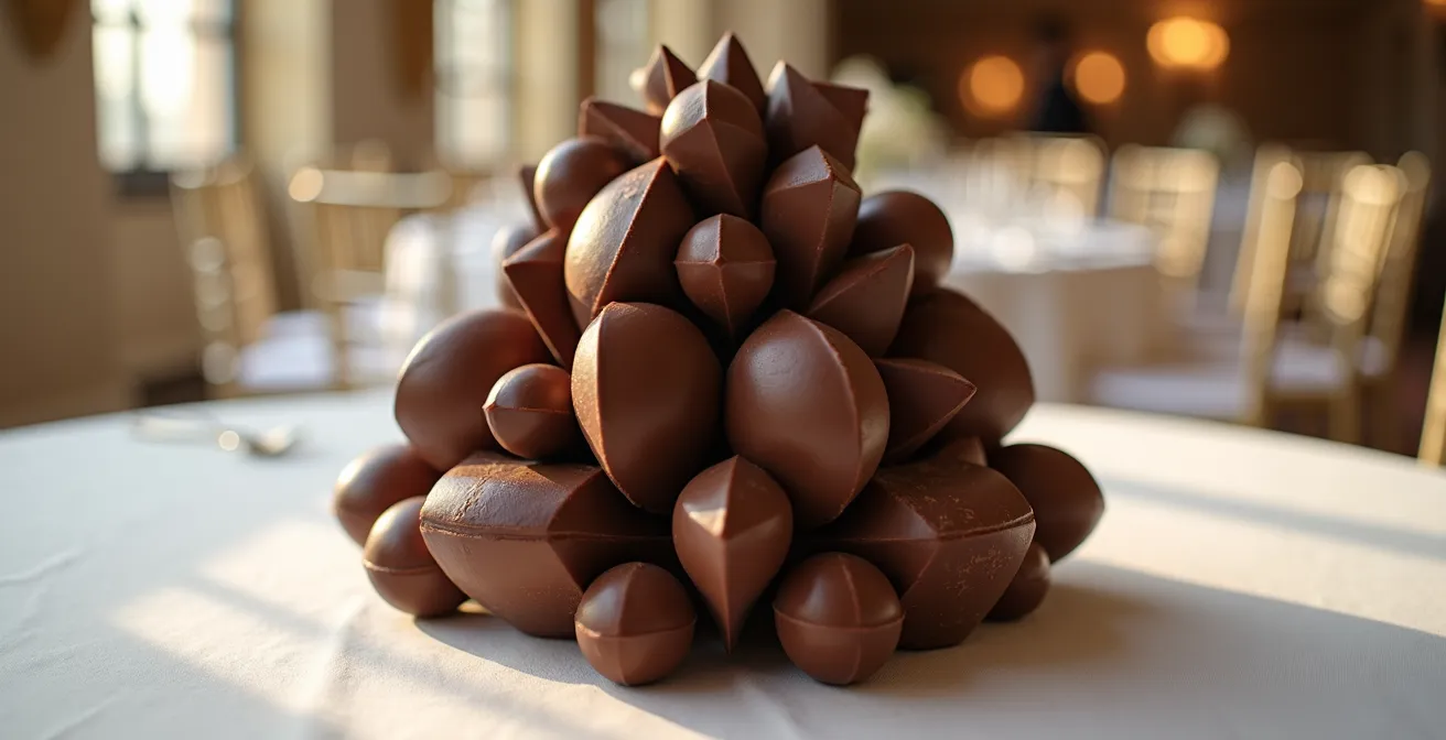
As the image above illustrates, a centerpiece can be architectural and breathtaking while being entirely composed of delectable, single-serving components. This philosophy prioritizes the guest experience. The visual impact is breathtaking upon arrival, and the flavor experience is uncompromised during dessert service. The sculpture is not destroyed; it is gracefully deconstructed. Therefore, the question isn’t “sculpture or flavor?” but rather, “How can the sculpture be designed to deliver the flavor perfectly?” The priority is always the final taste, and the visual artistry is the vehicle to present it.
The Over-Garnishing Mistake That Ruins 80% of Elegant Chocolate Tarts
In the quest to make a dessert look “fancy,” the most common mistake is over-garnishing. It comes from a place of insecurity—a feeling that the dessert itself isn’t enough. The result is a chaotic plate crowded with competing flavors, textures, and colors: a sprig of mint, a dusting of powdered sugar, three different berries, a drizzle of raspberry coulis, and a chocolate curl. This “more is more” approach is the antithesis of Michelin-star plating. According to professional pastry chefs who report that 80% of elegant chocolate tarts are ruined by this exact impulse.
The core principle being violated is that of the sensory narrative. A well-composed plate should have a clear focal point, a “hero” element, which in this case is the chocolate tart. Every other item on the plate is a “supporting actor,” there for one of two reasons: to complement a flavor in the hero or to provide a necessary textural contrast. If a garnish doesn’t serve one of these two specific purposes, it doesn’t belong on the plate. A single, perfect raspberry whose tartness cuts through the richness of the chocolate is a thoughtful supporting actor. A random sprig of mint is just a visual distraction.
This philosophy of restraint is what creates an elegant and confident presentation. As leading culinary masters emphasize, the plate must have a clear hierarchy.
A dessert plate should have only one ‘hero’. If the tart itself is visually complex, the garnishes must be minimal ‘supporting actors’.
– Michelin-starred culinary masters, School Street Bistro Plating Perfection Guide
Before adding any garnish, ask yourself two questions: “What story am I telling?” and “Does this element contribute to the plot?” If the answer is unclear, leave it off. Negative space on a plate is not emptiness; it’s a frame that draws the eye to the hero. A confident chef knows that the perfectly executed tart is the star of the show and doesn’t need a crowd of extras to make it shine.
What Color Plates Make Chocolate Desserts Look 50% More Appetizing?
The plate is not a neutral background; it is the canvas upon which your culinary art is presented. Just as a painter chooses a canvas to enhance their subject, a pastry chef must choose a plate that elevates their chocolate dessert. The color, texture, and finish of the plate can dramatically alter the perception of the food, making it look more vibrant, luxurious, or decadent. While there’s no single color that works for every dessert, understanding the principles of contrast and harmony is key to making your creations pop.
The most classic choice, white porcelain, offers high contrast that makes the deep, rich color of dark chocolate stand out. It’s clean, timeless, and allows any colorful garnishes to take center stage. However, for a more dramatic and contemporary feel, dark plates are a powerful tool. A matte dark grey or natural slate plate absorbs light, which has the paradoxical effect of making any glossy element on the dessert—like a mirror glaze or tempered chocolate decoration—appear even shinier. This creates a sophisticated, moody presentation that screams luxury.
The choice of plate color can also be used to enhance specific flavor notes within the dessert. A blue or teal plate, for example, is a complementary color to the orange and brown tones in chocolate and caramel, making those flavors appear visually richer and more intense. The goal is to create a cohesive visual palette that supports the dessert’s sensory profile. For a detailed guide on matching plates to desserts, this comparative analysis is an invaluable resource.
| Plate Color/Material | Visual Impact | Best Use Case |
|---|---|---|
| Matte Dark Grey/Slate | Absorbs light, enhances chocolate gloss | Dark chocolate desserts with texture contrast |
| White Porcelain | High contrast, clean presentation | Milk chocolate or colorful garnishes |
| Blue/Teal Stoneware | Complementary color makes chocolate richer | Desserts with orange/caramel notes |
| Copper/Gold Charger | Adds luxury and warmth | Special occasion presentations |
Ultimately, the plate should serve the dessert, not compete with it. A study of the impact of different plate materials shows that texture is as important as color. A rustic, handmade stoneware plate tells a different story than a sleek, minimalist porcelain one. Choose the canvas that best tells your dessert’s story.
Why Do Blue Chocolates Sell Less Than Red or Gold Ones?
The color of food is a powerful, primal signal to our brains. Long before we can smell or taste something, we judge it based on its color, which is deeply linked to our evolutionary instincts for survival. This is the realm of color psychology, and it explains why certain hues are universally appealing in food while others are met with subconscious resistance. For chocolatiers, understanding this is crucial, as it directly impacts a customer’s desire to purchase and enjoy a confection.
Red and gold are consistent winners in the world of chocolate. Red is the color of passion, energy, and, most importantly, ripeness. Think of ripe berries and fruits; our brains are hardwired to see red as a signal of sweetness and peak flavor. Gold, on the other hand, is a universal symbol of luxury, quality, and celebration. A touch of gold leaf or shimmer on a chocolate bonbon instantly elevates its perceived value. It doesn’t just look expensive; it promises a premium experience.
In stark contrast, blue is a color that performs poorly in the food world. The reason is simple: evolutionary biology research indicates that blue is one of the rarest colors in nature for food. Aside from a few exceptions like blueberries, blue is often a sign of spoilage, mold, or poison. As a case study of Michelin-starred restaurants reveals, pastry chefs instinctively avoid blue decorations. Customers subconsciously associate the color with artificiality or danger, creating a mental barrier to enjoyment, no matter how delicious the chocolate may be. Even if we logically know the blue bonbon is safe, our primal brain remains skeptical. This is why you’ll see a prevalence of earthy browns, rich reds, and opulent golds in high-end pastry shops—they are speaking a visual language our brains are eager to accept.
Why Do 3 Raspberries Look Better Than 4 on a Tart?
This question gets to the heart of a fundamental principle of artistic composition that separates amateur plating from professional design: the rule of odds. When arranging elements on a plate, using an odd number (one, three, five) almost always creates a more dynamic, natural, and visually appealing composition than using an even number. This isn’t an arbitrary rule; it’s rooted in how our brains perceive harmony and tension. An even number of items, like four raspberries, allows our brain to easily pair them up and create symmetry. The result is static, predictable, and ultimately, a little boring.
An odd number, however, forces the eye to move. With three raspberries, for example, the brain instinctively forms a triangle. This triangular shape creates movement and visual tension, making the composition more engaging. One element is left over, which keeps the viewer’s gaze actively scanning the arrangement. As plating experts explain, this subtle asymmetry is key to creating a look that feels both intentional and effortlessly natural.
An even number creates a static, symmetrical shape that the brain processes quickly and finds boring. An odd number creates a dynamic triangle.
– Professional plating experts, Fine Dining Lovers Plating Techniques
This principle applies to everything from the number of quenelles of ice cream to the placement of chocolate shards. The goal is to guide the viewer’s eye around the plate in a pleasing way. A symmetrical, even-numbered arrangement stops the eye dead in its tracks. An asymmetrical, odd-numbered arrangement invites the eye on a journey across the plate, creating a more memorable and sophisticated visual experience.
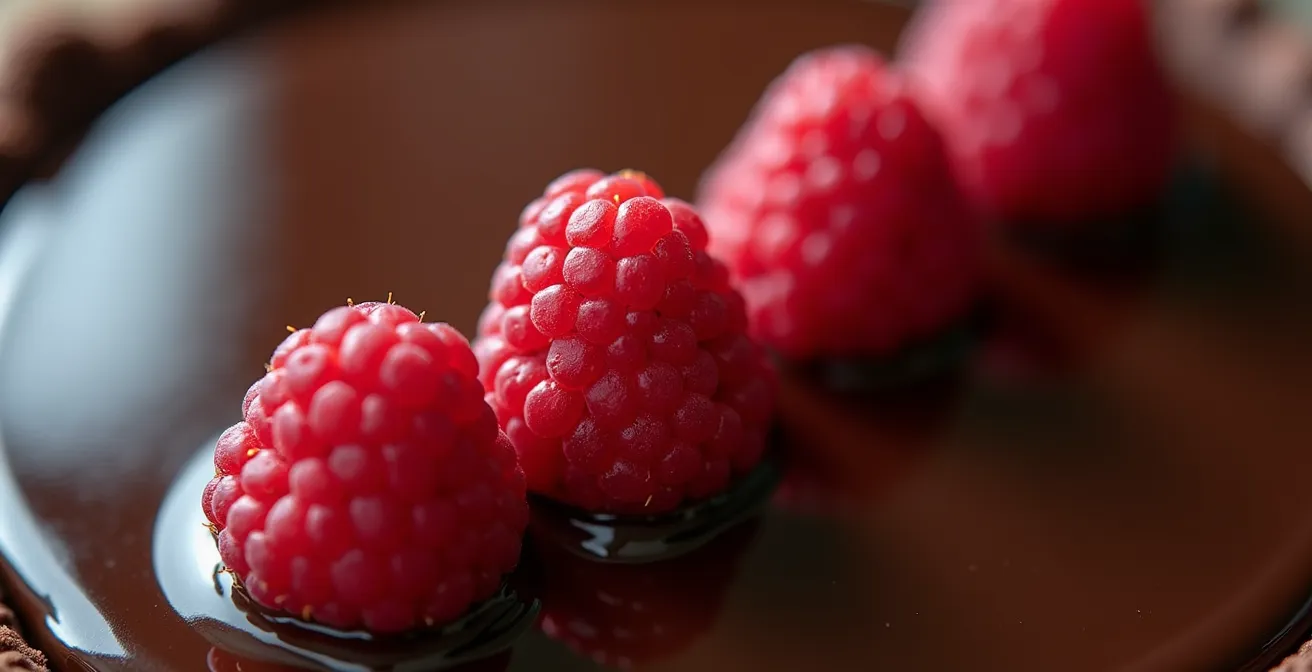
Look at the image of the tart above. The three raspberries form a subtle, off-center triangle that adds a sense of grace and movement to the entire dessert. Had there been four, they would likely have been placed in a square or a straight line, creating a rigid, formal look that lacks artistic flair. It is in these small, deliberate choices that the eye of the art director truly shows.
Key Takeaways
- Plating is a psychological tool: visual cues like color, composition, and even the weight of cutlery directly influence the perception of flavor.
- Elegance lies in restraint: a successful plate has a clear “hero” element, and every garnish must serve a specific purpose (flavor or texture contrast), not just decorate.
- Embrace asymmetry and tension: using odd numbers and dynamic arrangements creates a more engaging and professional look than static, perfect symmetry.
How to Design Signature Bonbons That Stand Out on Instagram?
In the crowded visual landscape of social media, a chocolate bonbon can’t just be delicious; it must be a piece of micro-art. For an aspiring chocolatier, Instagram is a critical gallery, and standing out requires more than just a glossy finish. It demands a signature style—a recognizable Visual DNA that makes your work instantly identifiable. This is about moving beyond creating individual, pretty chocolates and instead designing cohesive, themed collections that tell a story.
A strong Visual DNA can be built around several pillars: a unique shape language (e.g., architectural and geometric vs. organic and nature-inspired), a specific and consistent color palette, or a mastery of a particular texture (like velvet flocking or hyper-realistic airbrushing). The key is consistency. A potential customer should be able to see one of your bonbons and immediately associate it with your brand. As a case study on MoldBrothers, a company endorsed by hundreds of Michelin chefs, shows, bonbons presented as themed collections with a consistent visual identity achieve significantly more engagement than random assortments. Their success highlights that a strong narrative sells.
But the design doesn’t stop with the chocolate itself. How it’s photographed—the micro-scenography—is just as important. This involves using textured backgrounds like slate or linen, employing dramatic lighting (chiaroscuro) to create mood, and applying classic compositional rules like the rule of thirds. To develop your own signature style, you need to audit your creative process from concept to final photo.
Action Plan: Auditing Your Bonbon’s Visual DNA
- Define Your Core Aesthetic: First, pinpoint your visual signature. Are you defined by architectural shapes, hyper-realistic forms, or a specific color palette? List the top three adjectives that should describe your work (e.g., “minimalist,” “bold,” “ethereal”).
- Inventory Your Collections: Instead of single pieces, plan in themed collections (e.g., ‘The Elements,’ ‘Phases of the Moon’). Collect images of your existing work and see if a cohesive theme emerges or could be enforced.
- Assess Your Scenography: Audit your photography backgrounds and props. Are they random, or do they support your core aesthetic? List all materials used (slate, linen, concrete, wood) and identify which ones best represent your brand.
- Analyze Your Lighting and Composition: Review your last 10 Instagram posts. Is the lighting flat or dramatic? Are you using compositional rules like the rule of thirds, or are your shots always centered and static? Score each photo on a 1-5 scale for visual dynamism.
- Create an Integration Plan: Based on your audit, create a priority list. Start by replacing inconsistent backgrounds, then practice one new lighting setup. The goal is to make every new post a deliberate reinforcement of your chosen Visual DNA.
–
By thinking like a brand director, you transform your bonbons from simple confections into coveted objects of design. This strategic approach is what captures attention, builds a following, and ultimately, turns viewers into customers.
Now that you are armed with the core philosophies of high-end dessert presentation, the final step is to apply them with intention. Begin applying these artistic principles today to elevate your next chocolate creation from simply delicious to truly unforgettable.