The common belief is that beautiful chocolates are about technical skill; the truth is, standout bonbons are born from brand strategy, not just craft.
- Your collection needs a “Collection Narrative”—a core story that dictates every choice of color, shape, and flavor to create a cohesive whole.
- Packaging isn’t an afterthought; it’s a “Perceived Value Ritual” that elevates the unboxing into an experience that justifies premium pricing.
Recommendation: Start with a “Design Blueprint”—sketching your story and visual identity—before you ever melt a single gram of chocolate.
You’ve spent hours, maybe days, perfecting your craft. Your bonbons are glossy, your flavors are balanced, and your technique is flawless. You post a photo on Instagram, proud of your creation, only to see it drown in a sea of other, equally beautiful chocolates. It’s a common frustration for aspiring chocolatiers: how do you create something that doesn’t just look good, but looks *different*? How do you build a visual identity that is instantly recognizable as yours?
The standard advice often circles around technical execution: use vibrant colors, get a better airbrush, or take better photos. While important, these are just tools. They are the ‘how’ without the ‘why’. This approach treats you like a technician executing a task, when you need to be thinking like a brand strategist building an empire. True distinction isn’t just about having a unique flavor of ganache; it’s about having a unique point of view that is expressed through every visual element of your work.
But what if the key to standing out wasn’t just in mastering the spray gun, but in mastering the art of storytelling? What if your collection could communicate a narrative before anyone even takes a bite? This is the shift from craftsman to creative director. It’s about understanding that a signature bonbon is the physical manifestation of a cohesive brand story, one that is meticulously planned from a conceptual sketch all the way to the final, strategic packaging.
This guide will walk you through that strategic process. We will deconstruct the elements of visual identity, from the psychology of color and the language of shape to the narrative power of a well-curated collection. By the end, you’ll have a framework for designing not just chocolates, but edible art that tells your unique story and builds your brand with every box sold.
To help you navigate this journey from technician to brand strategist, this article is structured to build your skills progressively. The following summary outlines the key stages we will explore, from understanding visual psychology to mastering the economics of your art.
Summary: A Strategic Blueprint for Signature Chocolate Design
- Why Do Blue Chocolates Sell Less Than Red or Gold Ones?
- How to Spray Cocoa Butter Without Clogging Your Airbrush Gun?
- Classic Praline vs. Exotic Fruit: What Defines a Modern Collection?
- The Copyright Trap of Copying Famous Mold Shapes for Commercial Use
- How to Sketch and Plan a 12-Piece Collection Before Touching Ingredients?
- Round vs. Rectangular: Which Frame Suits Linear Desserts Best?
- Clear Bags vs. Rigid Boxes: Which Increases Perceived Value More?
- How to Price Your Homemade Chocolates for Profit at Local Markets?
Why Do Blue Chocolates Sell Less Than Red or Gold Ones?
The first element of your bonbon’s visual grammar is color. While a splash of electric blue might seem innovative, it often fails to connect with consumers on a primal level. The reason lies in psychology and learned associations. Colors like red, deep brown, and gold resonate because they align with our expectations of what chocolate should be: rich, indulgent, and natural. Red suggests ripe berries, gold evokes luxury, and brown is the color of cocoa itself. These colors feel authentic and appetizing.
In contrast, blue is one of the rarest colors in natural foods, often associated with mold or artificial additives. This creates a subconscious hesitation for the consumer. It’s no surprise that a recent study found 54% of consumers prefer pure chocolate without artificial colors, signaling a desire for authenticity. Even if your blue is derived from a natural source like spirulina, the initial visual read can be “unnatural.”
This psychological response extends beyond the bonbon to its packaging. Research conducted in South Africa on confectionery packaging discovered that purple and red were the most influential colors in stimulating purchase intent. Purple, in particular, was associated with luxury and indulgence, tapping into a deep-seated desire for a premium experience. When building your brand’s color palette, you are not just choosing pretty shades; you are selecting emotional triggers. Your colors should tell a story that feels both desirable and true to the promise of the flavor within.
How to Spray Cocoa Butter Without Clogging Your Airbrush Gun?
Once you’ve defined your strategic color palette, you need the technical mastery to execute it flawlessly. A clogged airbrush gun is more than a technical nuisance; it’s a barrier between your artistic vision and the final product. Achieving a vibrant, even, and thin layer of colored cocoa butter is essential for that signature gloss, and it all comes down to temperature control and preparation. Clogging is almost always a result of cocoa butter that is too cold, too thick, or improperly filtered.
This paragraph introduces the complex technique of airbrushing cocoa butter. The illustration below breaks down the delicate application process, showing the fine mist creating a perfect gradient on the mold.

As you can see, the process requires precision. To avoid the dreaded clogging and achieve a professional finish, you must follow a strict workflow. This isn’t just about melting and spraying; it’s a tempering process for your colors. Following these steps will ensure your cocoa butter flows smoothly and your designs are crisp and vibrant, allowing your visual grammar to be expressed without technical compromise.
A professional workflow for spraying cocoa butter involves several key stages:
- First, heat your base cocoa butter to 50-55°C (122-131°F) and add your colorants, ensuring they are fully dissolved.
- Next, strain the colored cocoa butter through cheesecloth or a fine-mesh sieve. This is a non-negotiable step to remove any undissolved pigment particles that cause clogging.
- Cool the mixture down to 26-27°C (79-81°F) while stirring, then gently reheat it with a heat gun to a working temperature of 29-30°C (84-86°F). This is your ideal spray viscosity.
- If you are preparing colors in advance, you can store the tempered colored cocoa butter in a chocolate warmer set to 30°C (86°F) until you are ready to use it.
Classic Praline vs. Exotic Fruit: What Defines a Modern Collection?
With your color palette and technique refined, the next layer of your brand story is the flavor itself. It’s tempting to rely on classics like hazelnut praline or salted caramel. They are safe, beloved, and guaranteed sellers. However, safety doesn’t build a standout brand. A modern collection is defined not just by its individual flavors, but by its “Collection Narrative”—the story that the flavors tell together. It’s about creating an experience that is both cohesive and surprising.
Today’s consumers are adventurers. They are actively seeking out new and exciting taste profiles, moving beyond the familiar. In fact, a major survey by Barry Callebaut revealed that 74% of consumers want to try new chocolate experiences. This is a clear mandate to innovate. But innovation isn’t about randomly pairing wasabi with white chocolate. It’s about thoughtful curation.
A truly modern collection finds a balance. It might feature a ‘hero’ classic, re-imagined with superior ingredients, sitting alongside an exotic yuzu or a savory miso caramel. The key is the narrative thread that ties them together. Is your collection a “Journey Through a Spice Market,” a “Childhood Memory Box,” or a “Minimalist Study in Texture”? Defining this narrative first gives you a filter for every decision. A classic praline can feel modern if it’s part of a “Textures of Nuts” collection, while a passionfruit ganache feels out of place in a story about “Winter Spices.” Don’t just make a box of chocolates; curate an edible exhibition.
The Copyright Trap of Copying Famous Mold Shapes for Commercial Use
As you build your unique narrative, the physical form of your bonbons—their shape—becomes a critical piece of your visual identity. In the quest for eye-catching designs, it’s easy to fall into the trap of using molds that replicate famous or trendy shapes. While this might garner initial attention, it fundamentally undermines your brand’s originality. Using a mold heavily associated with a famous chocolatier is like a painter selling prints of the Mona Lisa and signing their own name. It prevents you from developing a recognizable shape language of your own.
The spirit of artisan chocolate is rooted in innovation, not imitation. True pioneers don’t follow trends; they create them. This ethos is perfectly captured by Pastry Arts Magazine’s tribute to the legendary Jean-Pierre Wybauw. Jerome Landrieu recalls his mentor’s innovative spirit:
Jean-Pierre Wybauw was the pioneer for the growth of the artisanal chocolate industry in the USA. He developed the first cocoa butter transfer sheet by creating a drawing, placing cellophane on top, and painting the design on the cellophane.
– Jerome Landrieu, Pastry Arts Magazine Tribute
Wybauw didn’t wait for a tool to exist; he invented it to bring his vision to life. This is the mindset you must adopt. Instead of searching for the perfect mold, think about how you can create a perfect expression of your brand. True originality in shape comes from custom solutions and clever combinations. Below is a plan to help you develop your own unique forms without infringing on others’ intellectual property.
Action Plan: Creating Original Mold Designs
- Start with Quality Basics: Use high-quality polycarbonate molds from reputable manufacturers (e.g., Chocolate World, Pavoni) but focus on simple geometric shapes (spheres, squares, simple facets) as a canvas for your decoration.
- Create Custom Textures: Use food-safe silicone putty to capture the texture of unique objects—a piece of driftwood, a faceted crystal, a vintage button—and use these to create custom texture mats for your molds.
- Explore Custom Molds: For a truly signature shape, consider using 3D printing services that can create a master model from your sketch, which is then used to create a vacuum-formed mold. This is the ultimate in shape language.
- Design Your Own Transfers: Following in Wybauw’s footsteps, design your own patterns and have them printed as custom cocoa butter transfer sheets. This makes even a simple round bonbon uniquely yours.
- Innovate Through Combination: Combine simple molds with advanced techniques. A half-sphere mold can become a base for an elaborate piped or sculpted topping, creating a shape that is impossible to replicate with a single mold.
How to Sketch and Plan a 12-Piece Collection Before Touching Ingredients?
The most successful chocolatiers do not start by melting chocolate. They start with a pencil and paper. The idea of creating a detailed “Design Blueprint” before production is the strategic core that separates amateurs from artisans. This blueprint is a comprehensive plan for your collection that maps out every element—flavor profiles, color palettes, shape language, and even production costs—to ensure the final box tells a cohesive and compelling story. It is the architectural plan for your edible art.
This paragraph introduces the idea of a design blueprint. The following image perfectly captures this strategic planning phase, showing a chocolatier’s hands mapping out a collection in an elegant sketchbook.
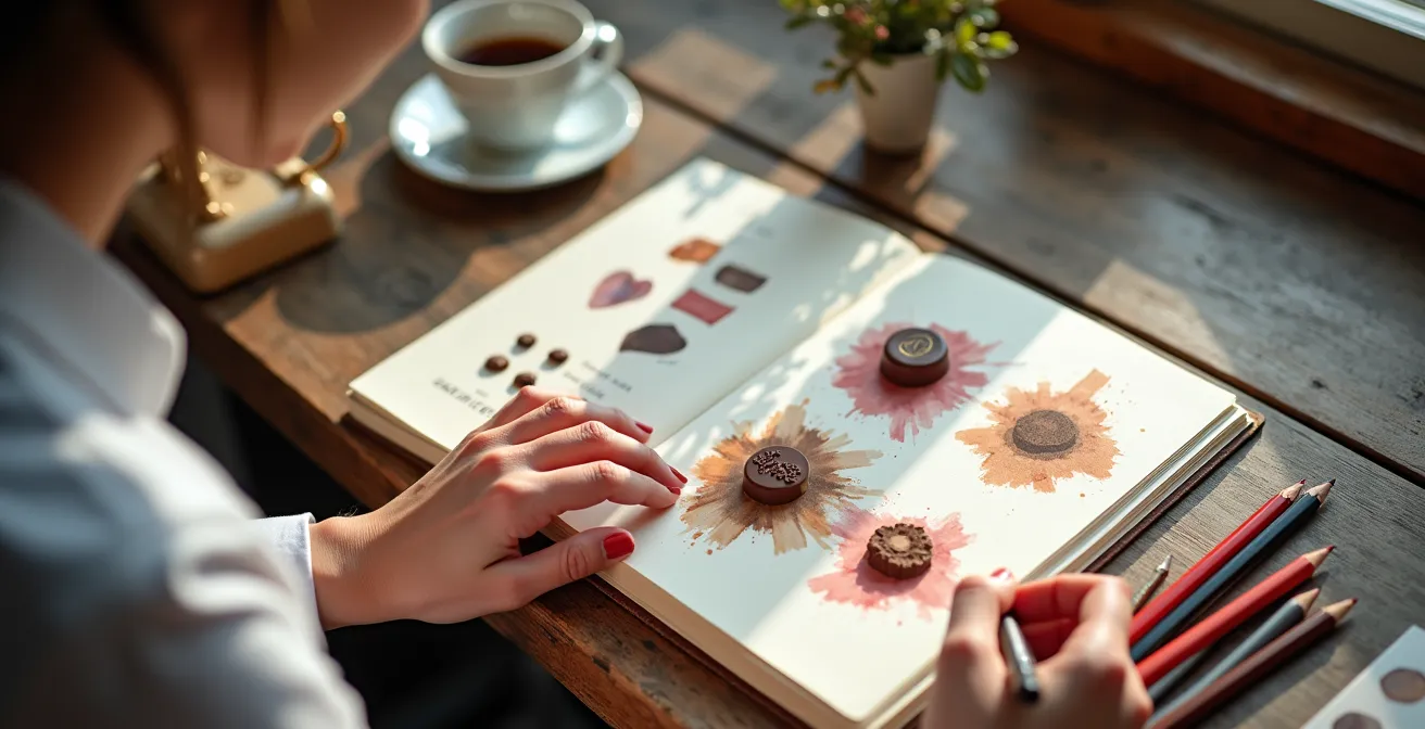
As the sketch suggests, this is a creative but highly structured process. This methodology, championed by masters like Jean-Pierre Wybauw, forces you to think through the entire collection as a single entity. According to his approach, detailed in his seminal work ‘Fine Chocolates: Gold,’ the blueprinting phase is where you establish the collection’s narrative. You decide how flavors will flow from one piece to the next, how colors will create a harmonious visual journey, and how the different shapes will interact within the box. This prevents the common mistake of creating a dozen beautiful but disconnected bonbons.
Your blueprint should be a working document. Sketch out shapes, create watercolor swatches of your color palette, write down your flavor concepts, and create a mood board of textures and patterns. Ask yourself: does this box feel like “a walk in an autumn forest” or “a night at the opera”? If a bonbon doesn’t fit the narrative, it doesn’t make the cut, no matter how delicious it is. This disciplined planning saves time and resources, but more importantly, it is the only way to ensure your final product is a powerful statement of your brand identity.
Round vs. Rectangular: Which Frame Suits Linear Desserts Best?
Once your collection is designed, the final composition—how the bonbons are arranged in the box and in the photograph—becomes the last step in your visual storytelling. This is where your “Shape Language” comes into full effect. The choice between a round or rectangular frame (or box) is not arbitrary; it dramatically influences how the viewer’s eye moves and what emotions are evoked. For an Instagram feed dominated by square and vertical formats, this is a critical strategic decision.
Rectangular frames are a natural fit for creating strong, linear compositions. They provide leading lines that guide the eye through the image, making them perfect for showcasing collections with a clear progression or narrative. Innovative chocolatiers like Stick with Me Sweets in NYC use this to their advantage, arranging their geometric bonbons in neat rows within rectangular boxes to create a powerful sense of order and rhythm that is highly satisfying on social media. This structure also allows for intentional use of negative space, making each bonbon a hero.
Round frames, on the other hand, create a sense of unity, community, and harmony. They draw the eye to the center and are ideal for compositions that feel more organic or eclectic. Beyond the frame, the shape of the bonbons themselves interacts with our perception. Smooth, rounded shapes often feel softer and more comforting, while sharp, geometric shapes feel modern and dynamic. This also ties into the sensory experience, as shape can influence how we perceive flavor and texture. With research by Barry Callebaut showing that 65% of consumers prefer chocolate with multiple textures, using varied shapes can be a powerful tool to signal a complex and interesting textural journey inside.
Clear Bags vs. Rigid Boxes: Which Increases Perceived Value More?
Your chocolate may be the star, but the packaging is the stage. The choice between a simple clear bag and a structured rigid box is one of the most significant decisions you will make for your brand’s perceived value. Packaging is not just a container; it is the beginning of the customer experience and the physical embodiment of your brand’s promise. A clear cellophane bag communicates honesty, freshness, and an artisanal, “straight-from-the-kitchen” feel. It is perfect for a farmers’ market context where transparency is valued. A rigid box, however, signals something entirely different: luxury, protection, and gift-worthiness.
The power of packaging is to create a “Perceived Value Ritual.” It transforms the act of opening a product into a ceremony. L.A. Burdick Chocolates is a master of this, elevating their packaging to an art form. Their signature wooden boxes, hand-stamped with gold wax seals and tied with silk ribbons, create an unboxing experience that is both theatrical and deeply memorable. This multi-layered ritual allows them to command premium prices, demonstrating that customers are paying not just for the chocolate, but for the entire luxurious experience.
The packaging you choose directly correlates with the price you can charge. It sets customer expectations before they even see the product. The following table, based on consumer perception research, breaks down how different packaging types impact value.
| Package Type | Consumer Association | Best Context | Price Point Impact |
|---|---|---|---|
| Clear Bags | Transparency, freshness, artisanal honesty | Farmers markets, casual gifting | Base to mid-range |
| Rigid Boxes | Luxury, protection, gift-worthy | Special occasions, corporate gifts | 20-40% price premium justified |
| Hybrid (sleeve + bag) | Accessible artisan quality | Retail shops, everyday luxury | 10-15% price uplift |
As this analysis of packaging’s effect on consumer choice confirms, a rigid box can justify a significant price premium. Your packaging choice is a declaration of your brand’s position in the market. Choose the one that tells the story you want to tell.
Key Takeaways
- Define a clear “Collection Narrative” before choosing flavors or colors to ensure every bonbon contributes to a cohesive story.
- Create a “Design Blueprint” with sketches, color palettes, and mood boards to act as the architectural plan for your collection.
- Engineer a “Perceived Value Ritual” through strategic packaging choices to elevate the unboxing experience and justify premium pricing.
How to Price Your Homemade Chocolates for Profit at Local Markets?
The final step in your journey from artist to entrepreneur is pricing. Many artisans undervalue their work, calculating prices based on ingredient cost and a modest labor fee. This is a mistake. Your price is not just a number; it’s the final piece of your brand’s communication. It tells the customer how much they should value your artistry, your story, and the entire experience you’ve crafted. Pricing based on cost alone ignores the immense value created by your unique design, your narrative, and your premium packaging.
You must shift to a value-based pricing strategy. Your customers are not just buying sugar, cocoa, and cream; they are buying your vision. And they are willing to pay for it. Don’t be afraid to price for a premium market, especially when you’ve done the strategic work to justify it. A comprehensive Barry Callebaut market study found that 54% of consumers still prefer to purchase premium, high-quality chocolate despite price increases. This audience is looking for quality and story, not a bargain.
To implement this, structure your pricing in tiers. Create a “Classic Collection” at a base premium price, then a “Signature Series” featuring your most innovative designs at a 25% premium. You could even offer a “Limited Artist Edition” with completely custom work at a 50% or higher premium. At a local market, don’t just display your chocolates—display your process. Show your sketchbook, your mood boards, and your inspiration. Use museum-style cards to explain each bonbon’s story. When customers understand the ‘why’ behind your work—the artistry, the planning, the narrative—the ‘how much’ becomes a reflection of true value, not just cost.
By shifting your mindset from a simple maker to a visual brand strategist, you are no longer just selling chocolates. You are selling a story, an experience, and a piece of your unique artistic vision. The next logical step is to pick up a pencil and sketchbook and begin crafting the Design Blueprint for your next collection.